
dash UI/UX
In-flight Entertainment
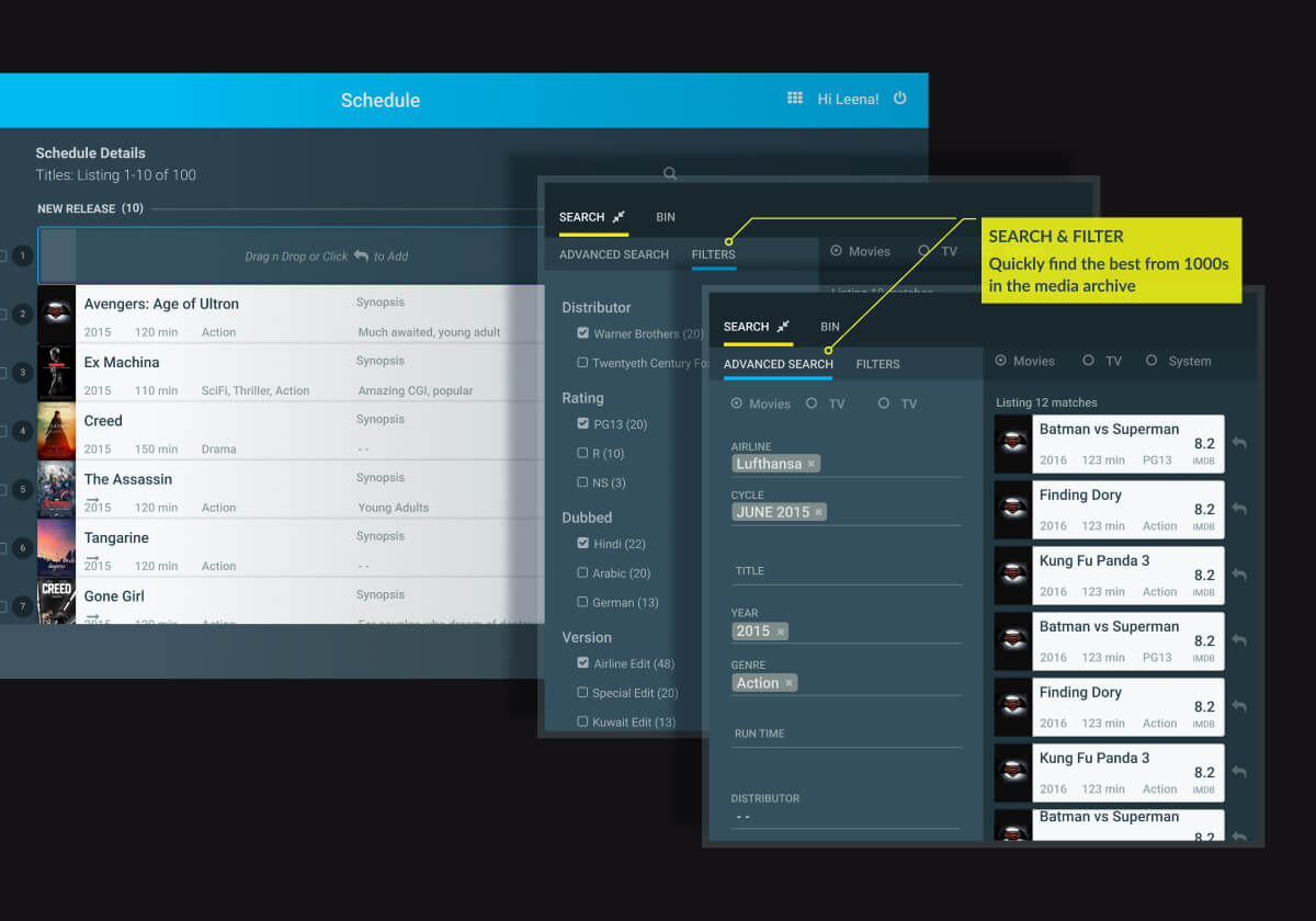
Scheduler
Time
2016
GEE is a world leader in curating high quality media for in-flight entertainment. The objective of this project was to transform their legacy practice to a MAM based workflow.
My job was to conceptualise and design the complete user experience of DASH. The UX design process and the solution we arrived at is a clear demonstration of how a complex UI problem becomes simple and intuitive when the design process focuses on users, their specific requirements and mindset.
Design Challenge
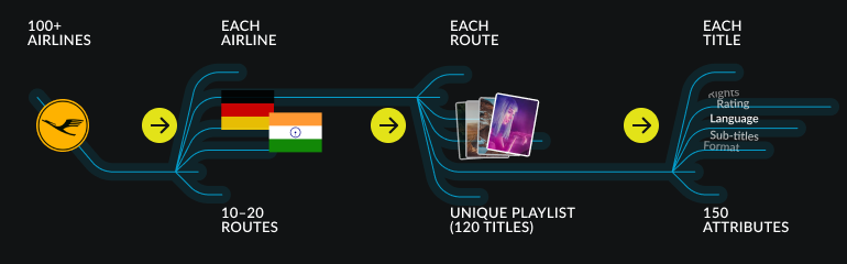
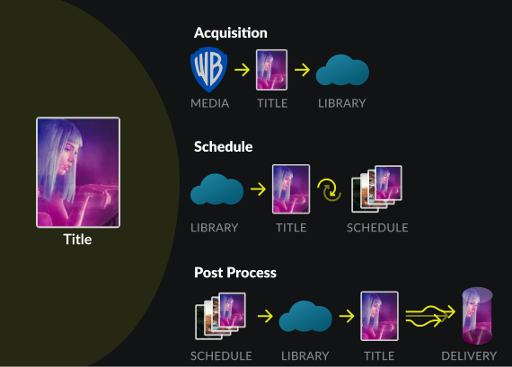
Airlines refresh their inflight content every month, with the latest and most popular movies and TV shows that match the specific cultural needs of each route and sector. Adding to this complexity is the fact that the video players vary hugely in terms of the type, size and format on flights.
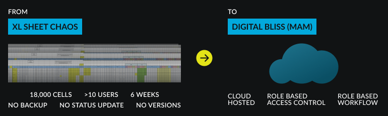
This whole process was a management nightmare. Conflicting XL sheets, lack of centralised data, and poor status tracking led to a lot of chaos.The challenge was to model a clear, gratifying and efficient UX, around a centralised cloud hosted system.
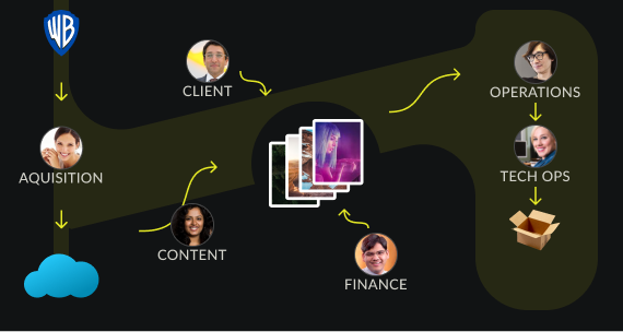
1. Key Players

Flight schedules are owned and managed by the content team. They work in close contact with each airline to finalise a schedule. They also collaborate with the acquisitions team, which in turn buys content rights and manages various media assets from media houses.
Finance approves the budget and tracks expenses.
Operations ensures language, subtitle and censorship needs are met, and finally transcodes the file into device-specific formats.
2. Identifying Building Blocks
The data model had various entities that users interact with. Modelling all the user interactions and then trying to create consistency between screens is difficult, if not impossible. When building such complex UX systems, an important step is to identify the most fundamental element on which all interactions or transactions are built.
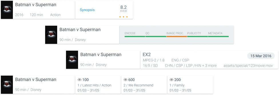
In this project, this was clearly the movie Title. It was clear to me that anything modelled for the movie title could easily be adapted to the other entities.
2.Detailing Core Interactions
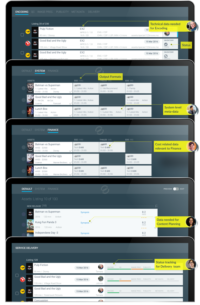
What each user looked for in a "Title" depended heavily on their role in the process and the context of the task they needed to complete. A typical user was only interested in 3-5 of the 150 attributes associated with a title for their specific task. This understanding brought tremendous clarity and suddenly the complex system began to look modular and simple.
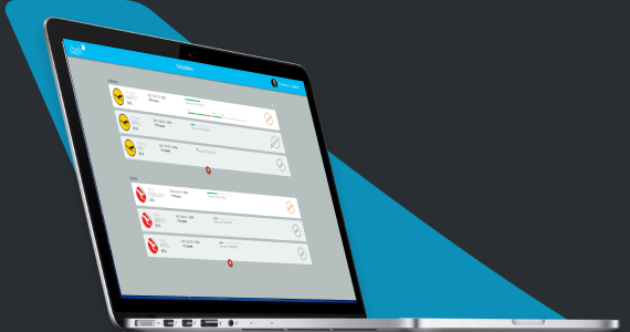
Card Based UI
I used contextual adapting cards for each media element that intelligently adapted to the user viewing it and the context in which it was being viewed to display only the absolute minimum necessary content. This drastically reduced information overload and helped highlight the data points necessary for decision making.
3. Role Based Interaction
A major concern from an user experience perspective was information overload. Users were dealing with large lists of titles at all stages.
4. Scalable UI Patterns

Fixed Left Panel
The left panel acted like a dashboard that showed status update, contextual analytics and quick filters. This reduced the need for complex cascading menus and multiple views. The UI adapted to the Users, depending on their role got what they wanted.
Sliding Right Panel
The system had an archive that consisted of more than 40,000 titles. Content team needed to look through with great care to identify the best match for different contexts. This complex functionality was handled by an advanced search panel that slid in from the right.
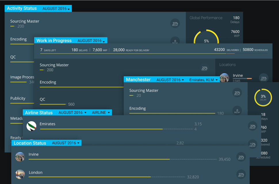
Dashboard Analytics
Operations Status
System Health
Performance Matrix
This client operated offices in the US and Europe, from multiple locations. Users logged in and used the system from anywhere. They accessed a cloud-based, centralised media management platform and library of all media assets. We designed several dashboards to improve project and workflow efficiency.
Design System
Colour & Typography

Responsive Design
The primary use case was within a corporate environment. All users worked on large desktops. A design that responsively adapts to small screens was not a priority. The responsiveness was limited to screens from 1200px wide upwards.